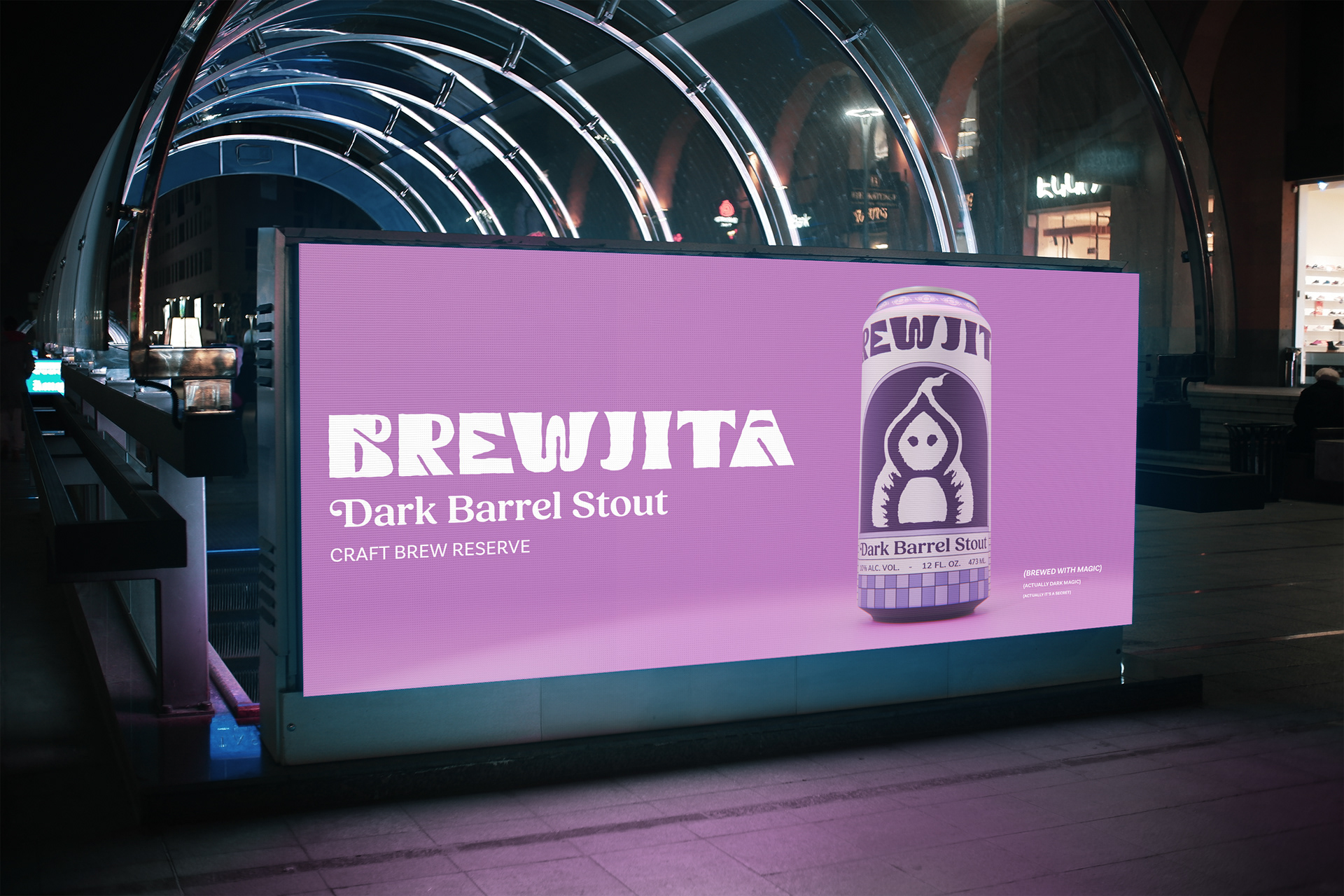
Brewjita - Dark Barrel Stout
If you do bad, better do bad well.
Traditionally, stout labels tend to portray a more mature, masculine approach. Due to stouts being very creamy and dark beers, they lean more towards conventional pub imagery and English or Irish cultural symbols.
The mission was to create a new type of standard for Stout labels. Something that was carefree, and a bit quirky. Inspired by traditional folk stories and cultural hertiage, Brewjita was born.
BREW + BRUJITA (WITCH) = BREWJITA
Brand personality
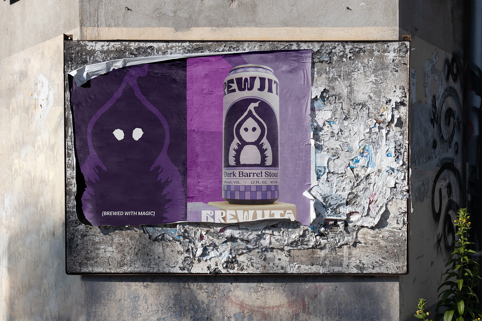
Brewjita is known for her extensive vocabulary. She is a master of the dark arts but secretly has a passion for botanic and colours. She is commanding, short, and loves to enchant people who mock her. She has a very sarcastic sense of humour. She is a master of hypnosis, and her house is upside down. She is a professional domino and chess player.
Only the bravest of people dare to taste her creation as she always jokes about the fact that you could get lost in the flavour, for eternity (meaning as long as she wants to enchant you). Her favourite colour is purple.


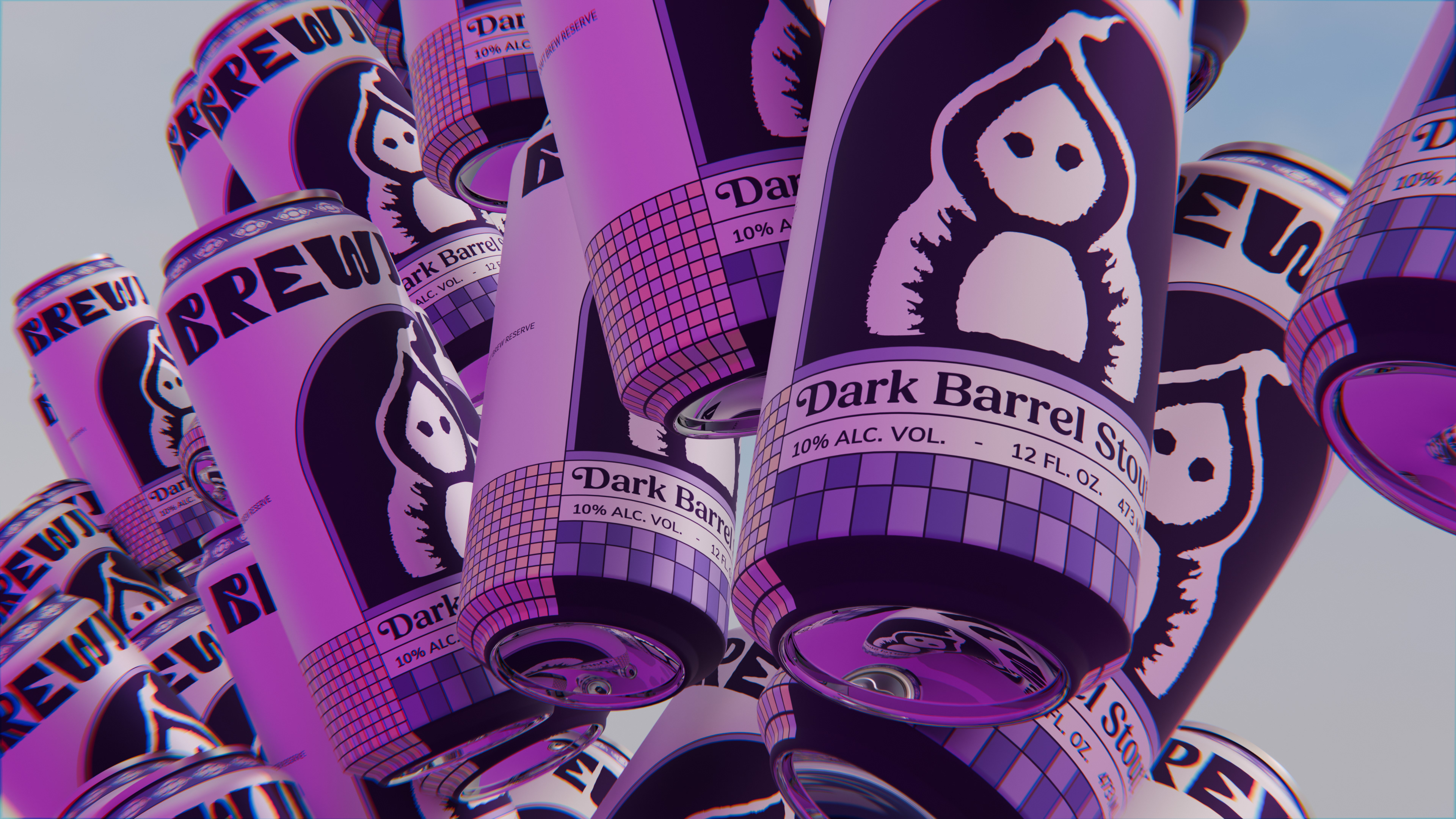
PACKAGING
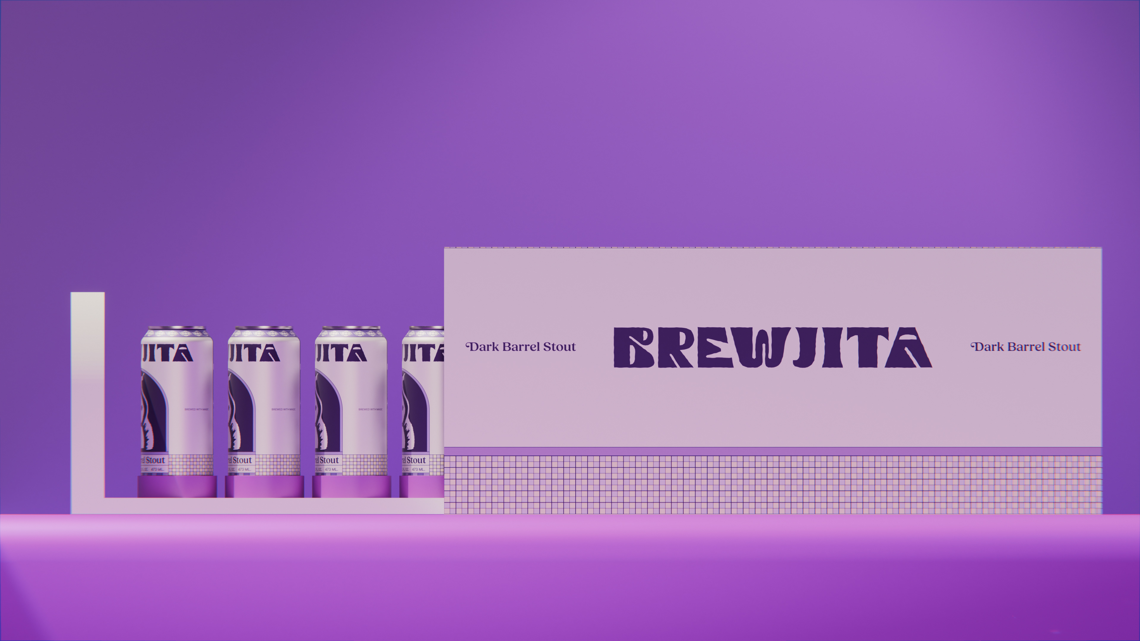
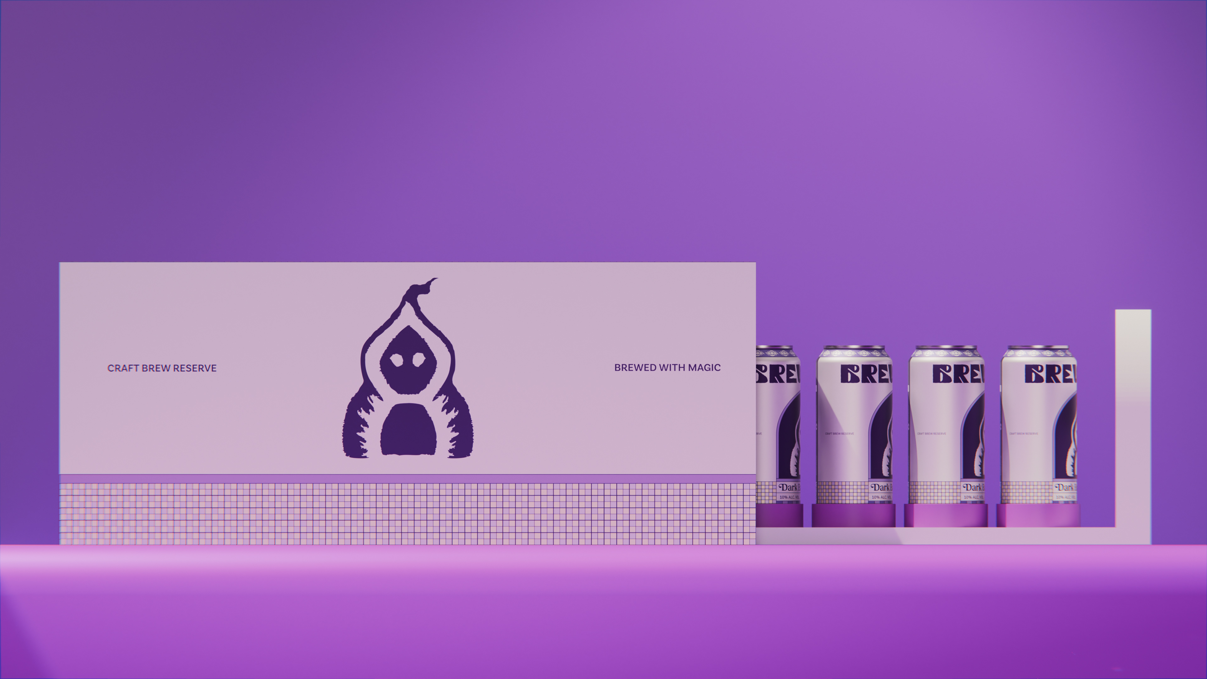
The six pack needed to represent the "window for the magic", proposing an original and elegant packaging that elevates the stout from the competition and settles it in a premium category.

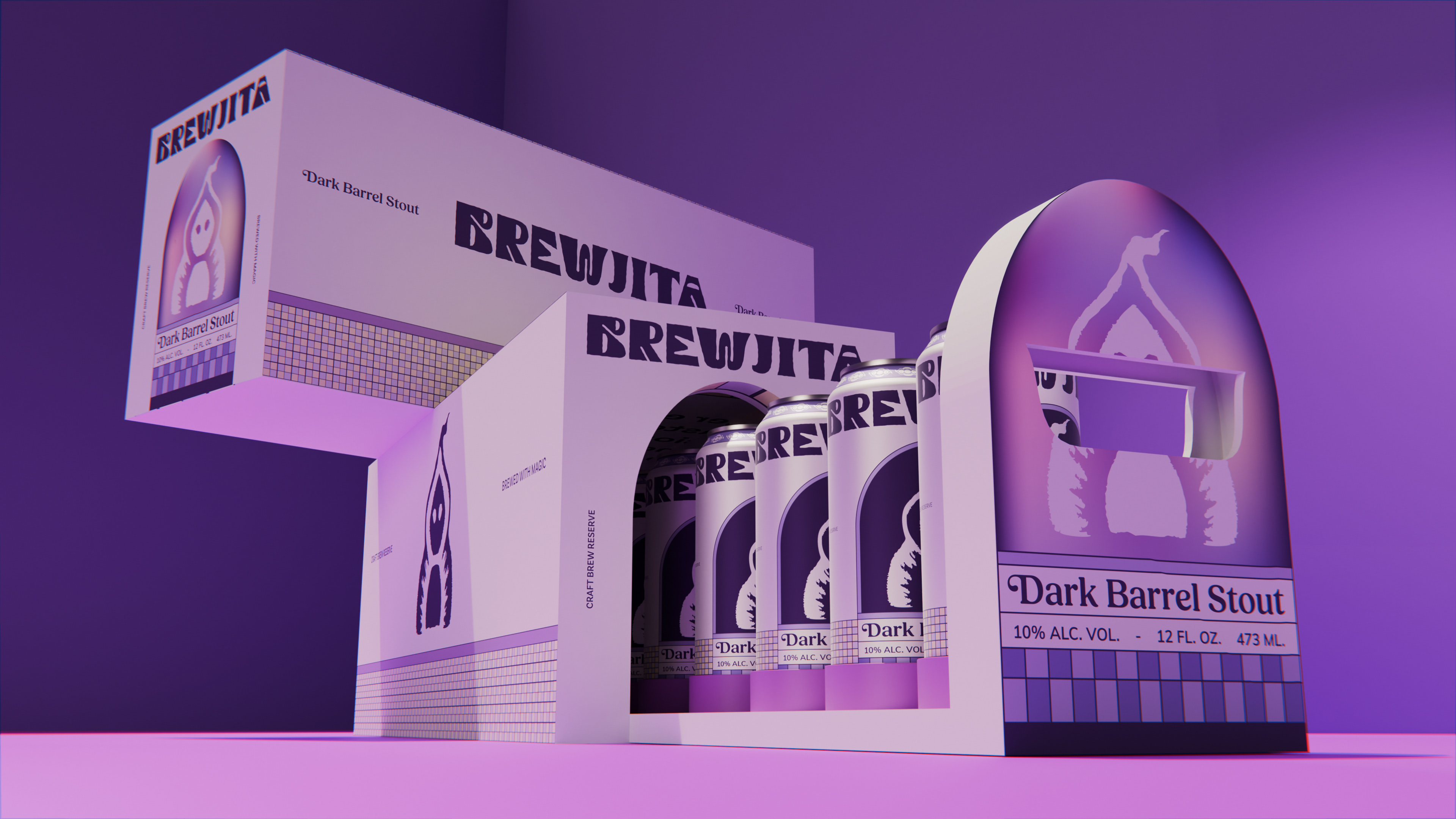
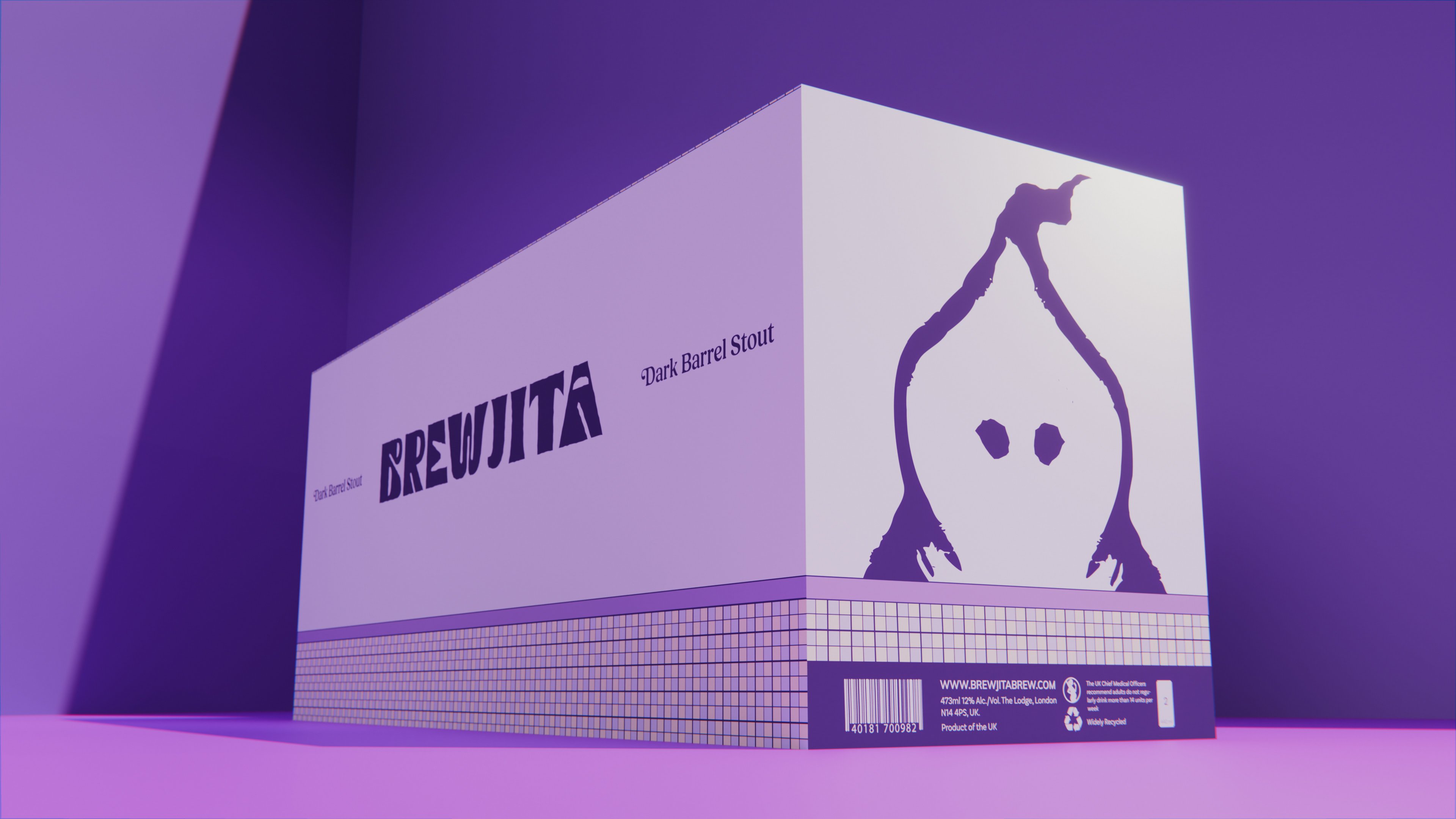
VISUAL IDENTITY
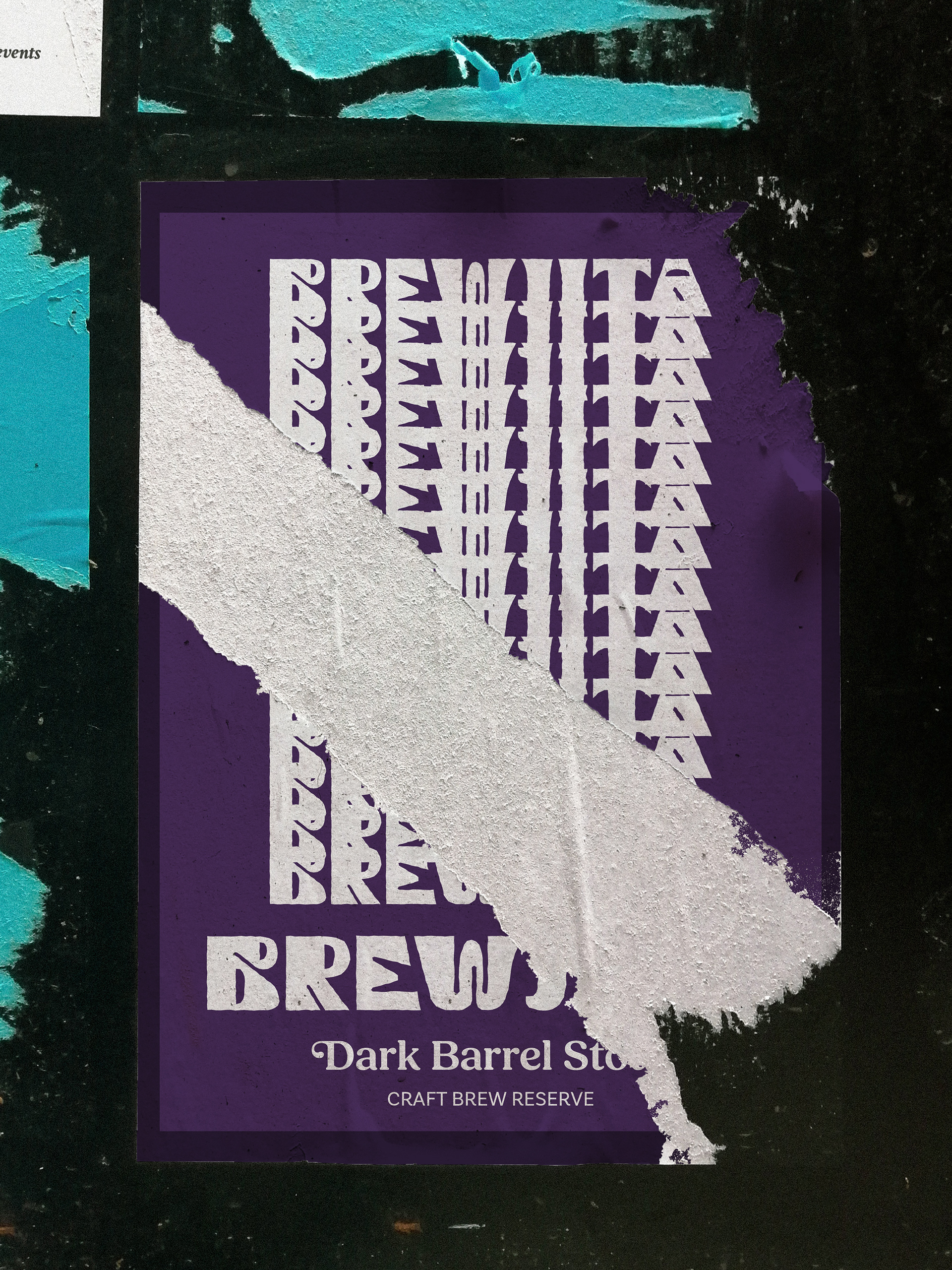
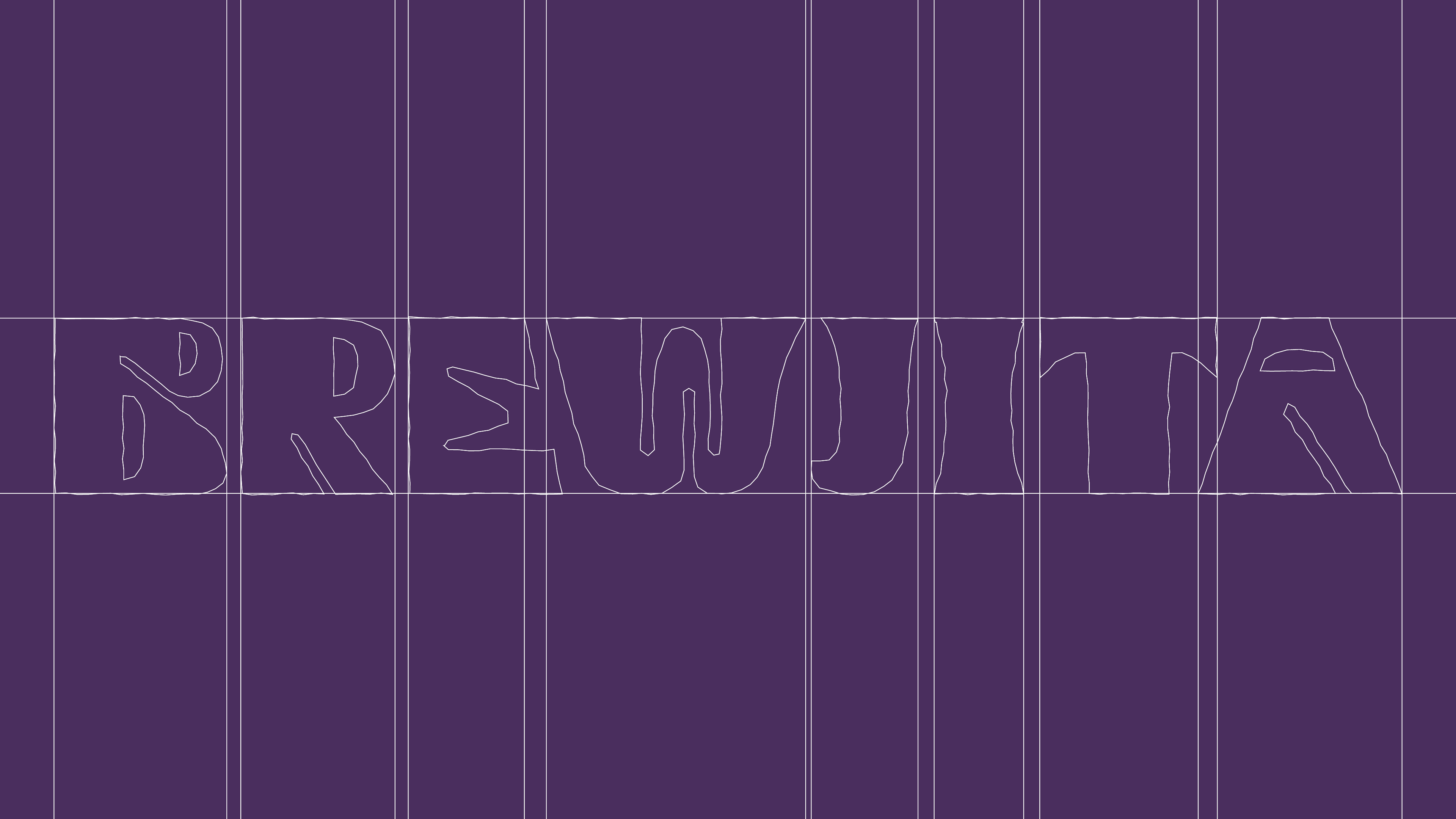
The logo had to represent the feeling of folk drawings, craftmanship and give "cuteness" to the witch. Many sketches were made for the custom lettering and icon.

Colours
The colour palette needed to represent the dark, luxurious and somewhat mysterious personality of the brand. Brewjita is a purist, she doesn’t like to mix with others. She is served in cold tall pints. Dark coloured and creamy.
